A first impression with a sense of place
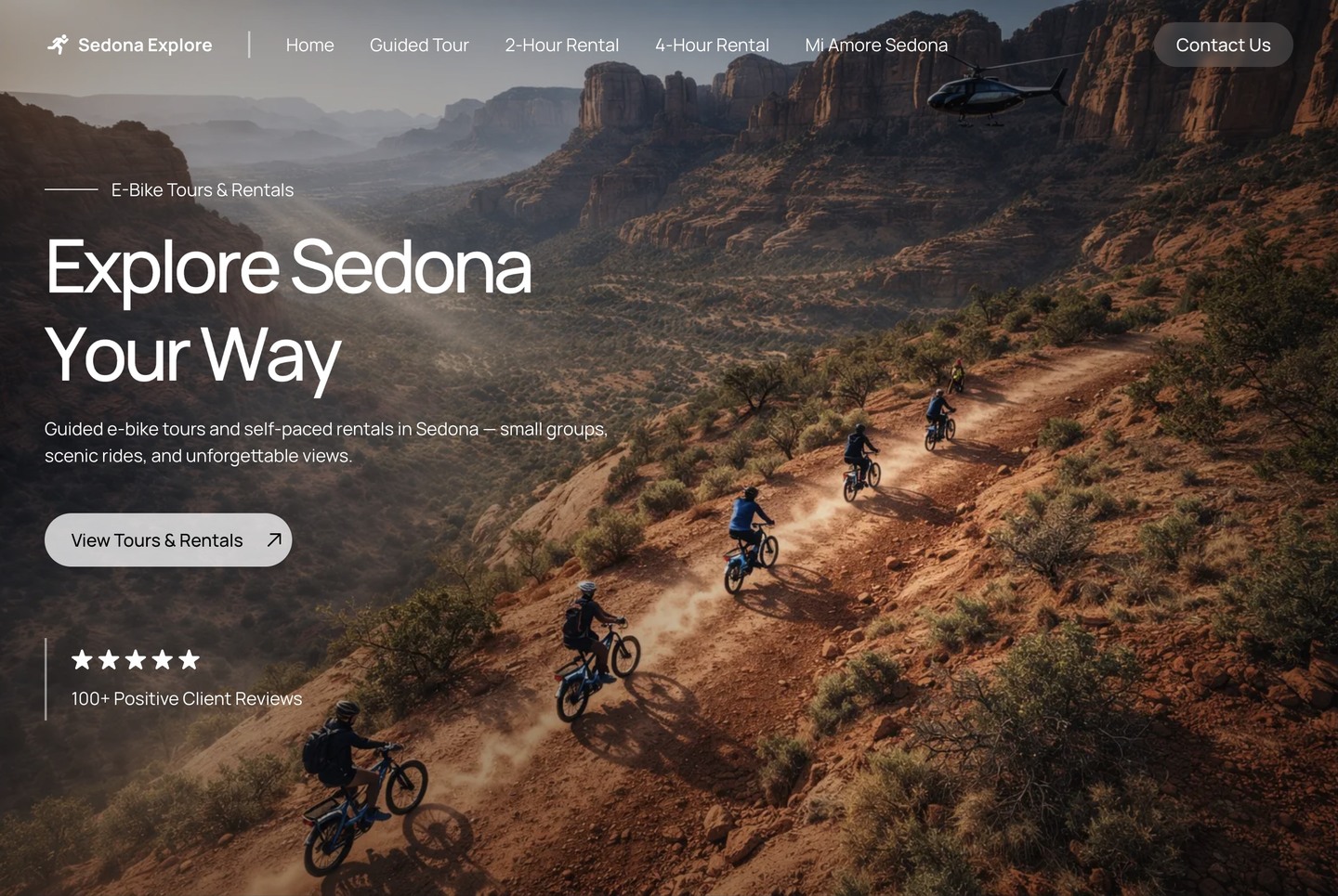
The expansive red-rock hero, large type, and subtle motion put the Sedona experience first. An image gallery continues that visual story as visitors scroll.
An immersive e-bike tours and rentals website, with a red-rock hero, animated sections, and dedicated pages for guided rides and self-paced adventures.
Visitors need to feel the appeal of a Sedona ride, then quickly understand which experience fits their trip. Guided tours and two-hour or four-hour rentals each need a clear introduction, useful details, and an easy next step.
HOW THE PROJECT RESPONDSThe Framer demo opens with the full-width “Explore Sedona Your Way” hero. Large red-rock imagery, a clear invitation to view tours and rentals, and animated headings introduce the experience. Below, an image gallery and individual offering cards help visitors explore the bikes, compare ride options, and find the information they need before choosing.
The expansive red-rock hero, large type, and subtle motion put the Sedona experience first. An image gallery continues that visual story as visitors scroll.
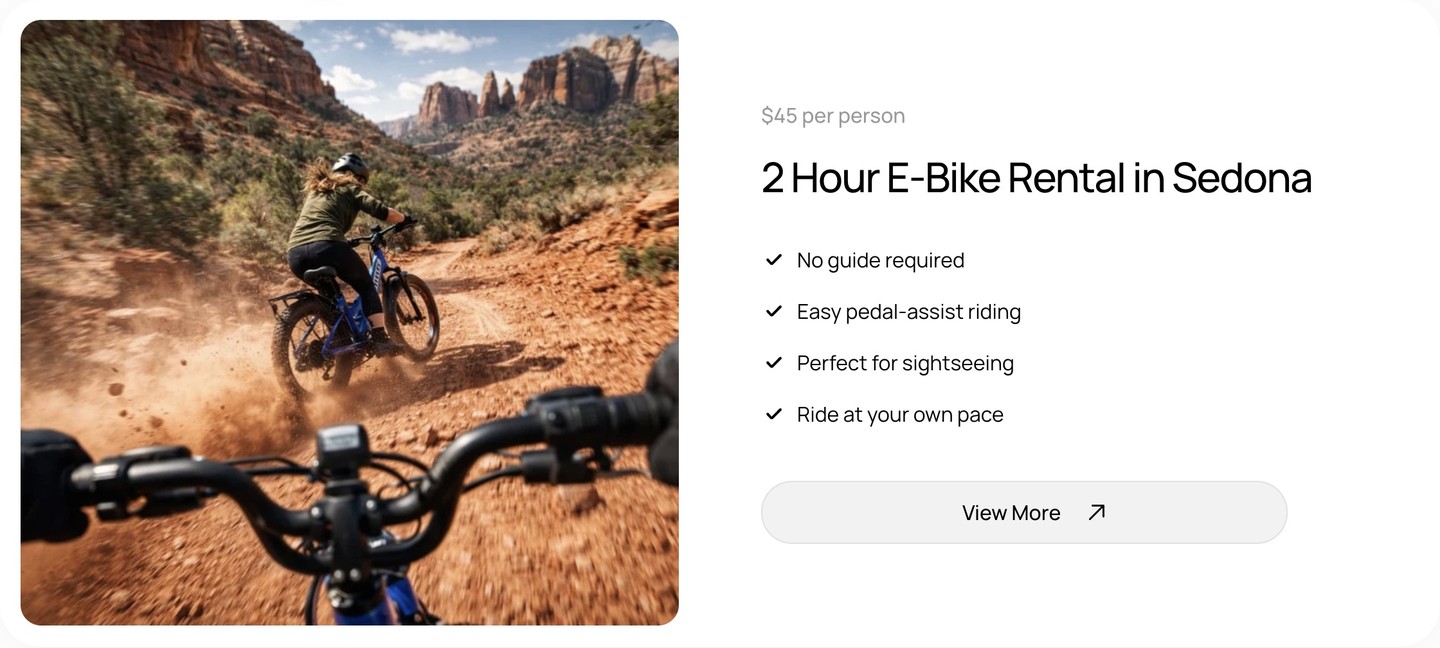
The demo separates the guided Bell Rock tour, two-hour rental, and four-hour rental. Offering cards present pricing and practical benefits, with links to individual detail pages.
FAQs cover experience level, beginner suitability, minimum age, where rides start, what to bring, and advance booking. Contact information and the connection to Mi Amoré Sedona give visitors a clear local starting point.
Website design and the customer journey for Sedona e-bike tours and rentals, demonstrated in the Framer project.
A tourism website should make people want to be there—and make the choices clear. Sedona Explore combines an immersive introduction with practical information about each ride. The booking needs behind this project also helped inspire the original concept for Vanta Booking.