- Tesla’s October 15 reveal is a demonstration; reservations, production timing and permitted use remain separate questions.
- A useful website preview answers one buying question and makes its assumptions visible.
- Measure whether customers understand the offer and take a useful next step, not just whether they click the demo.
Prepared with AI-assisted research and source checks on October 16, 2026. Business examples are illustrative; no Roadster test drive, customer experiment or conversion result is claimed.
What Tesla actually showed
At its October 15, 2026 event, Tesla demonstrated a new Roadster that could launch into the air and rotate in flight. AP reported the reveal the following morning, along with Elon Musk’s stated 2028 consumer-production target. That is a future target, not a car ready for ordinary customers to collect today. [1] (opens in a new tab)
Tesla’s own page separates Performance, Thrust and Rocket. It describes the flight-capable Rocket version as invite-only, with one seat, regional restrictions and no approval for public-road use. The company attributes its flight control to cold-gas thrusters; the page also describes a fan-and-sealing system that produces downforce. Those are Tesla’s descriptions, not independently verified performance results from this article. [2] (opens in a new tab)
The US reservation screen checked October 16 shows $5,000 due initially and $45,000 within ten days. These are reservation payments, not the full vehicle price; AP reported that Tesla had not announced that price at the reveal. An exciting demonstration, a reservation and a delivered product are different stages. [3] (opens in a new tab) [1] (opens in a new tab)
For a business owner, the event offers a useful design question: which part of your offer is difficult to believe or imagine until someone sees it happen? A website can give that question a small, concrete answer. It does not need a spectacle to do so.
Give the customer one thing to change
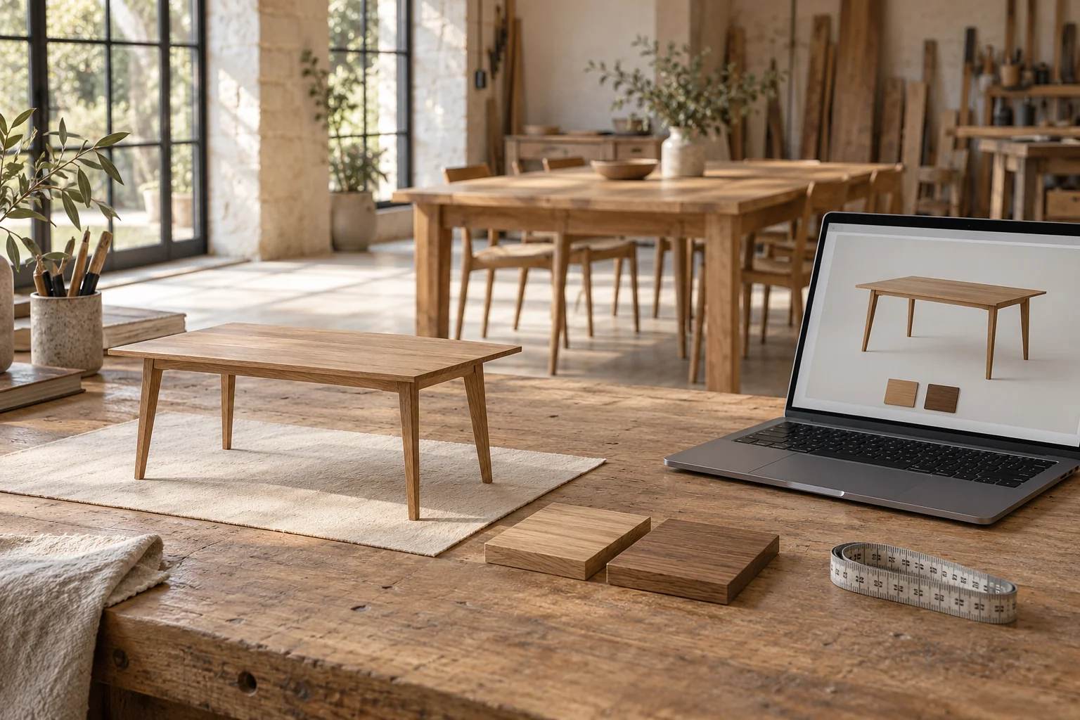
Imagine an independent tablemaker. The work is beautiful, but “made to suit your space” leaves a visitor doing a lot of mental work. They want to know whether the longer top looks too heavy, whether dark oak suits their room, and what they would actually be asking the maker to build.
A useful first preview could offer two lengths and two finishes. Choose a length and the table image changes with its written dimensions. Choose a finish and a real sample photograph appears beside it. The page keeps a short selection summary visible. Nobody needs to create an account to explore those four combinations.
160 × 85 cm
A shorter tabletop with a pale finish. Show its actual outline and dimensions together.
The customer can compare proportions.
200 × 85 cm
A longer tabletop with a deeper finish. Update the image and measurement at the same time.
The customer still needs to measure the room.
Then the visitor can send that selection with a question. The maker receives “200 × 85 cm, dark oak” instead of an email saying “something like the one on your website.” This is a proposed workflow, not a measured improvement or a feature already delivered for a client.
The preview should leave meaningful questions open. Screen color cannot settle the exact appearance of a physical finish. A table outline cannot verify doorway access, chair movement or room measurements. Offer a real finish sample where appropriate, and ask the maker to confirm specifications, price and lead time before accepting an order. A useful preview makes that conversation more specific.
The best format depends on the uncertainty
If someone needs to see a result, start with photographs or a short demonstration video. A carpet cleaner might show a clearly described real job, with permission, rather than a dramatic synthetic before-and-after. If someone needs to compare options, a few buttons that change an image may be enough. Interaction earns its place when the customer’s choice changes what they learn.
For a service, the “product” can be a sample of the process. A bookkeeper could let a visitor explore a fictional monthly report and open plain-language explanations of each figure. A photographer could show how three different image selections change the feel of a sample album. Use invented data or cleared samples, and say what is being demonstrated.
Three-dimensional viewing makes more sense when shape is central to the decision. Shopify already documents a scanner in its app for compatible iPhones and iPads, allowing products to be viewed from different angles or previewed in a customer’s space. This is an existing capability, not something Tesla’s announcement has just made available. [4] (opens in a new tab)
Its limits matter. Shopify says smooth, reflective, thin or flexible objects can be difficult to capture well; not every product will produce a usable model. For a small seller, preparing accurate product media may be the expensive part. Good photographs can be the stronger choice when a model distorts the thing someone is considering buying. [4] (opens in a new tab)
Build a small demonstration with an honest boundary
For the tablemaker, a first version can use approved images and a fixed set of options in the existing website. Each choice should correspond to something the maker can actually build. The work is defining valid combinations, making the images agree with the dimensions, and ensuring the inquiry carries the selection accurately.
If the page shows an estimated price, explain what the estimate includes and what could change it. Do not display a delivery date as confirmed unless it comes from a system that can support that commitment. If the business is still testing an idea, label the experience as a concept and offer an interest form instead of implying the product is available.
A custom feature gives control over the experience, but someone must maintain the options and images. A hosted configurator or demo tool can reduce some development work while introducing subscription costs, vendor limits and another place where data may go. Ask what happens to the preview if that service is unavailable or the subscription ends. Neither route comes with a universal price; the range of options, quality of media and connections to real systems drive the work.
For the simplest trial, keep experimentation in the browser and request contact details only when the visitor deliberately sends an inquiry. Avoid copying real customer records into a sample report or demo account. A demonstration should not have the power to place real orders, change inventory or send messages accidentally.
A premium experience still has to be easy to use
Keep the preview inside the reading flow, with quiet labels, clear selected states and enough space to understand the result. The controls should feel like part of the site. A large animated scene can be impressive and still leave a customer unsure where to click or how to get back to the product details.
Make the same choices available with a keyboard, and provide meaningful written descriptions alongside images. W3C’s keyboard guidance explains why pointer actions need a keyboard equivalent. Try the actual experience without a mouse; a visible control that cannot be reached is not useful to everyone. [5] (opens in a new tab)
Respect reduced-motion preferences and avoid unnecessary spinning, sliding or zooming. W3C’s guidance on interaction-triggered animation describes ways to let users prevent nonessential motion. These are practical design requirements to check, not a claim that one widget certifies an entire website as accessible. [6] (opens in a new tab)
Check a narrow phone screen and an ordinary connection. Show a useful still image and written details while richer media loads, and preserve an easy contact route if the preview fails. The customer should still understand the offer when the decorative part cannot run.
Find out whether the preview answered the question
Before launching widely, ask a few people unfamiliar with the business to try one task: choose a table they would discuss with the maker, then explain what they think is confirmed and what still needs checking. Watch where they hesitate. If someone believes a preview guarantees room fit or a delivery date, fix that misunderstanding before adding more features.
After launch, compare useful inquiries, missing information and staff time spent clarifying choices with a similar period beforehand. Treat small samples and changes in traffic cautiously. Demo starts and time spent are clues; they do not establish sales or prove that the feature caused an improvement. Use consent-aware measurement and keep personal inquiry details out of analytics events.
Some businesses will learn that they only needed better photographs. The Mi Amoré Sedona portfolio project uses photography, the shop’s story and practical visit details to help people imagine a visit. It is not an interactive configurator. The right next feature depends on the question the existing presentation leaves unanswered.
Tesla made a future vehicle visible in a memorable way. Your useful version might be much smaller: one table changing size, one sample report opening, or one customer saying, “Now I understand what I’m asking for.” Start with that moment, then build only what makes it clear.
Sources & further reading
Sources used in this guide. Checked October 16, 2026. Study dates and scope are shown where they affect the interpretation.
- 01Tesla’s new Roadster reveal and production outlook (opens in a new tab)Associated Press
October 16 reporting on the October 15 event; production timing is an attributed target, not a delivery guarantee.
- 02Roadster: versions, capabilities and restrictions (opens in a new tab)Tesla
Official product page checked October 16; vendor descriptions are not independent performance tests.
- 03US Roadster reservation page (opens in a new tab)Tesla
US payment schedule checked without making a reservation; deposit amounts are not the vehicle price.
- 043D scanner: requirements and limitations (opens in a new tab)Shopify Help Center
Supported devices, product characteristics and scanning limits.
- 05Understanding keyboard access (opens in a new tab)W3C Web Accessibility Initiative
Explanation of WCAG 2.2 success criterion 2.1.1; not a certification of a particular website.
- 06Understanding animation from interactions (opens in a new tab)W3C Web Accessibility Initiative
Explains controlling nonessential motion and respecting reduced-motion preferences.